
New House, New Charm!
Good friends of ours just bought their first home together! We were so excited for them to start their new marriage in a new home. While they loved their new home, their new home was less than satisfactory in their eyes as far as color. It was in need of a face-lift and personality overhaul. So we started right away trying to capture the right homey feelings with some new colors! (All Benjamin Moore)
The Foyer, which they wanted to be light and airy, was not so light and airy with this dark green!
Welcome Home!


Instead, we went with Edgecomb Gray.
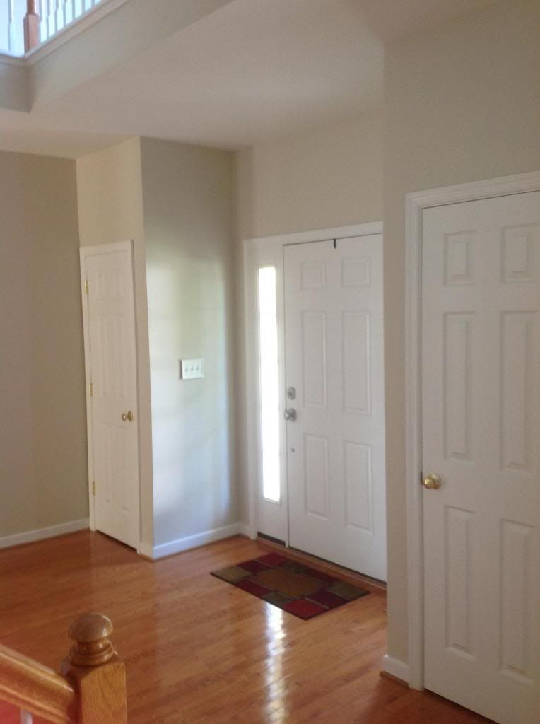

Wow! What a new look!!
One of the next biggest transformations was the family room. It was a dark gold/caramel color and just a little harsh feeling. Not the cozy, relaxing feel they were looking for. They originally wanted a neutral but once I showed them this darker blue, they fell in love!


Here's the new improved living room in Templeton Gray......
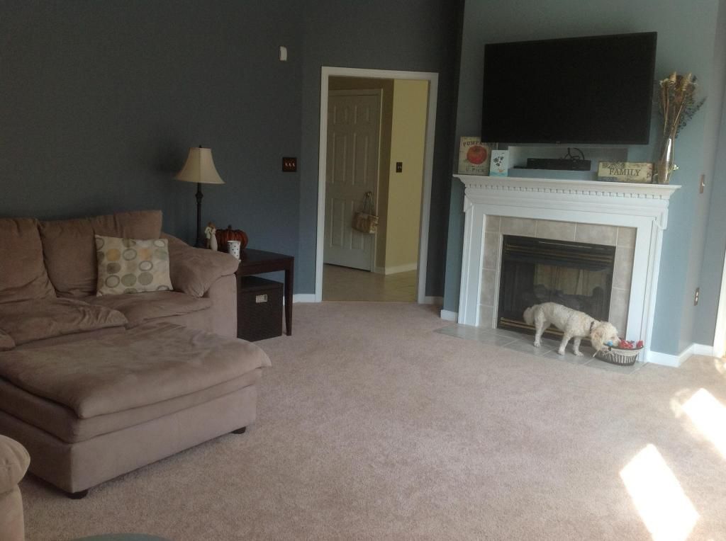
It's hard to see in this pic but the fireplace has a contrasting lighter color Waters Edge.
.jpeg)
With their living room being full of light, we decided to go with a little more color on the walls than just a neutral. The natural light in this room really works well with this darker shade of blue and their tan furniture.
I don't think they ever thought it would turn out to be one of their favs=)
The kitchen and hallway were bright yellow and didn't flow well with the rest of the downstairs, not to mention it was way too bright! So we chose a color that would be a nice compliment to the living room since they are side by side. It's called Abingdon Putty.
Here's the originial color.......


Here is the new color and it sure did tone things down a bit!
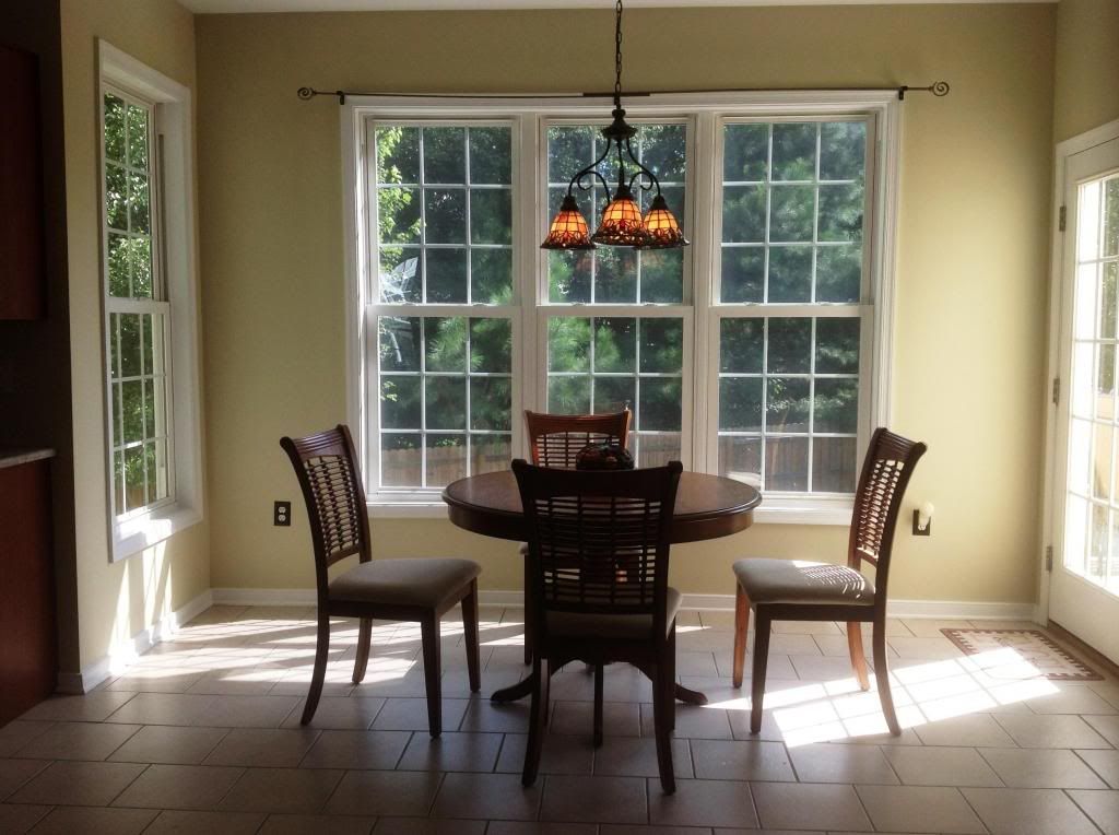
The dining room was the same bright yellow color as the kitchen so we chose Salisbury Green. Since jt is beside the kitchen(this lighter color above) and the foyer(Edgecomb gray) we wanted a bit more color to make it pop!
Here are both pic's of the dining room.......


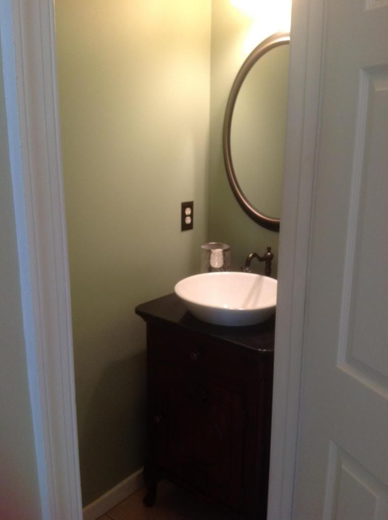
The downstairs bathroom was quite shocking as well in it's rich gold/caramel color with the sponging over top. We chose to tone that down using the Salisbury Green.
It's much calmer in this small hall bath with the lighter color.

Now that's better!
The Master bath was a baby blue so we chose a softer spa color White Rain which makes it a bit more subtle and to compliment the Master bedroom color of Cape Hatteras Sand(pic to come later).
Old.....

New.....

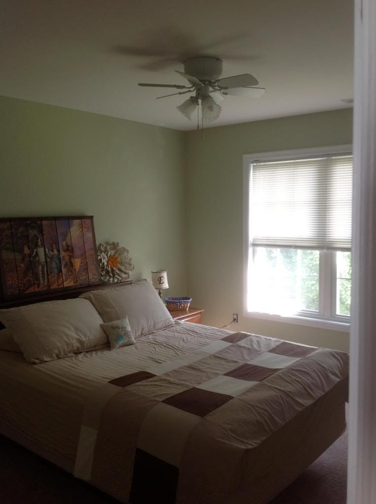
They decided to give some new life to two of the guest bedrooms as well.
Here's one of the guest rooms in Guilford Green.

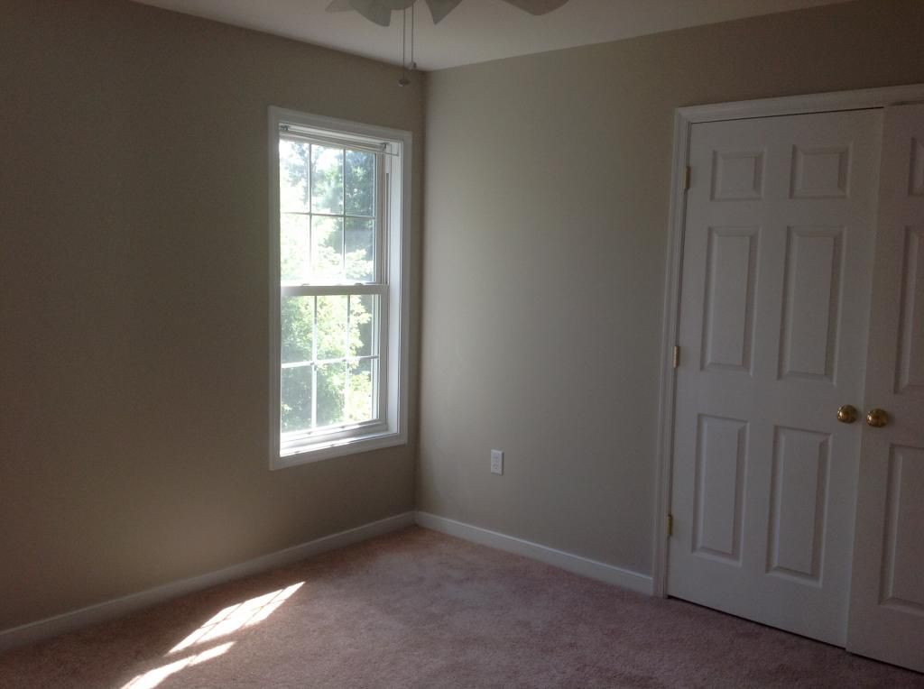
The second guest room was quite bright so they went for a much more neutral to go with any color scheme. The new color is Revere Pewter
Old.....

New.....
I want to thank my good friends for letting me help with this process. It takes a good bit of trust and I'm so glad it turned out just as they'd hoped. What a beautiful house and now with some much needed personality changes, it feels like home to them!
No comments:
Post a Comment